Color Theory: Spring 2025
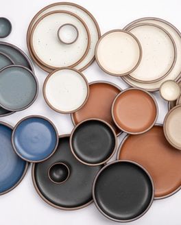
If you’ve spent any amount of time around here, you know we don’t pick our seasonal colors out of a hat. Each pairing is a little love letter—to the current moment, to the land around us, to a cultural movement. Inspiration for this season’s duo, Yuzu and Prune, was sparked on a quiet mountain hike, but between the first mood boards and the release of the colors, a hurricane swept through North Carolina. In the midst of uncertainty, the colors took on new meaning—quiet reminders of resilience, care and beauty still showing up.
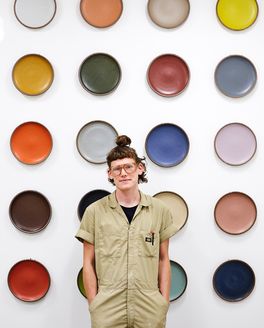
We sat down with Nicole Lissenden, our Head of Design, to talk about how this pairing came to be, why certain colors are worth bringing back from the vault and the inspiration behind this season’s art photography.

What was the inspiration behind our current seasonal pairing—a zesty yellow and a soft purple?
Yuzu and Prune are two colors from our vault, but the color story came together early last spring as the first blooms were opening up in Western North Carolina. My husband and I happened to have a cabin weekend just before I needed to present a color direction, and it is typically pretty crucial for me to have that kind of time away from my desk to soak up inspiration. On a hike up Bearwallow Mountain, I couldn’t ignore the forsythia and redbud. I love the way color works within a landscape—getting up close to the tiny yellow forsythia blooms and taking the color in full saturation, and zooming out to the next peak across a valley a pink/purple haze washed over swaths of land. It was a beautiful day connecting with nature and the launchpad for this seasonal collection.

How did you decide to bring Yuzu and Prune back?
The #WeSwoonForPrune messaging from our customers worked! We pay attention to what they’re asking for and try to weave it into our plans where we can. It’s been in the back of my mind for a while, and it intersected with what was inspiring me at the time, so we went for it. We try to balance our seasonal palettes so there’s something for everyone, and Yuzu felt like a joyful glaze to bring out of retirement.

In addition to choosing our seasonal colors, you also conceptualize our art photography for each season. Which was your favorite set of images from this launch, and where did the idea come from?
Around the time we were planning our seasonal direction and product assortment late last summer/early fall, I just really needed to hand over some of my brainspace to something joyful and hopeful. I thought a lot about how planting something was an exercise in trust and hope for the future, how nature endures and finds a way even in the hardest circumstances, how something as simple as smelling a flower can lift your mood. I really love these kaleidoscope images. We were looking at a lot of art nouveau and playing with pattern and nature, and this set in particular is really more of an inward exploration. Yes they’re for East Fork but really they’re for me :)

I couldn’t have imagined how much deeper this spring would hit when I made the first mood boards for this collection last year. After Helene and after winter set in, I think I had a vague sense that the leaves and the flowers would never come back. But they have come back, the ones that can, and now our region is green and blooming in a way that feels pretty astonishing. This purple branch came from a larger branch that all but broke off of its tree during the storm. Hanging by a thread, it still managed to bloom. I don’t get it scientifically, but the emotional message comes through loud and clear. Even in brokenness, signs of resilience are everywhere. We have endless capacity for beauty, and the beauty hits deeper when it’s born out of heartache. I’m comforted by the things that feel the same as previous years, and am stretched by the things that feel different. And always, so grateful for spring.

Which other East Fork colors are your favorites to pair alongside Yuzu and Prune?
I love Prune with all of our neutrals, but it’s extra special with Amaro. Yuzu is perfect with Eggshell, and so fun with other bright colors like Big Sky!